Monday, August 26, 2013

Essie "Maximillian Strasse-her"

From Essie's Spring 2013 Madison Avenue collection comes this cool grey-green gem. I'm not sure why it was marketed as a spring shade, this seems much more appropriate for a summer-fall transition to me. They describe it as "Bavarian style savvy rules this regal boulevard. With nails of cool grey green, you're promenade queen, no tiara required." I don't know about all that. Named for one of the four royal avenues of Munich, Germany, according to Wikipedia, this shade is just awesome. A fairly watery jelly, it nonetheless applies beautifully in just two coats. It is like the somewhat-muted version of my beloved 'Turquoise and Caicos" - more fall appropriate. almost a neutral really, like a greened-out khaki. Love. Also has the dubious honor of having the LONGEST name of any polish that I own. 


Some bright sunlight, some shade. :)


Deborah Lippmann "B!tches Brew"

WOW. I was searching for a nice dark red that wasn't too goth, and came across this gem on another blog. After reviewing it on Google (let's be honest, I never buy polish without checking all of the reviews! I do my research!) - I went ahead and splurged on this gem.
And boy am I glad that I did. 

This red is deep, without a hint of purple - maybe just slightly berry-tinted. No black at all, just red. It really glows in the sunlight, like rubies. Application was a dream, and nearly opaque in one coat. I did two and the color just intensified so much. I anticipate getting a lot of wear out of this color over the coming fall and winter - perfect fall shade, gorgeous color, and almost a week of wear-time with barely any damage! I think this is from an old collection of Deborah Lippmann, but if you can find it an don't mind the splurge ($15 here), it is 100% worth it. Just adore this one. 


Tuesday, August 20, 2013

OPI "Pink-ing of you" and Butter London "Rosie Lee"

This is a very similar manicure to one I did last week - pink and glitter combo! This time I used OPI "Pink-ing of you" and Butter London "Rosie Lee."

Let's start with the OPI. It's from their 'soft shades' collection, but it really is quite pink. Not very subtle, but very girly. I actually had this done on a professional manicure (courtesy of the SO), and loved it so much I had to pick this color up for myself. A lovely basic pink, perfect application in 2 shades. A+!
Argh - sorry for the lopsided shot! :)
Butter London has kind of been a hit-or-miss company for me. Nice formulas but their colors are... weird. "Rosie Lee" is nice though, all pink glitters. Smaller glitter size than the Essie "A Cut Above", similar color. A pain in the butt to remove though. Lovely rose-goldy shade. A- for difficulty in removing it. 


Butter London "Victoriana"

Oy. Where do I start with this one. I picked up this shade at my local Ulta because of all the rave reviews their polishes get, this one in particular getting a LOT of attention. I love teals, I love glitter, how could this not be a winner?
Somehow, this shade totally falls flat for me. It reminds me of this horrible pair of blue jeans I had in middle school that had this awesomely horrific glitter sprayed all over them, that left a trail of sparkles like pixie dust wherever I went. Don't judge, it was the '90's. Anyway, this nail polish reminds me of them. I couldn't even get through a day wearing this. It applied beautifully, and removal was a breeze despite the large silver glitter, but this color just doesn't work for me AT ALL. B+ : awesome formula, but I can't stand this color, despite the hype it got.

Also, HOW ON EARTH did this company find it appropriate to describe this color as "A textured twinkling vintage pale blue nail lacquer. Things reminiscent of the Victorian era, such as corsets, top hats and Syphilis. " -- syphilis? Really??


Essie "Sunday Funday"

It's not QUITE this orange
This is a lovely orangey-coral shimmer jelly from Essie's summer 2013 collection. Essie describes it as "turn everyday into a ridiculously good time with this beautiful, tangerine crush coral nail polish with soft shimmer."
Not sure if I'd call it tangerine, definitely coral-leaning-orange. Orange is normally NOT a color I gravitate towards - it just doesn't do well with my complexion. Corals, however, look awesome on me. I think that's why I love this so much. Definitely more coral with beautiful gold shimmer. This shade has been on my toes for weeks now. :) A lovely fun summer shade, excellent application, A+! 
Hard to capture the shimmer- promise it's there! ;)


Thursday, August 15, 2013

Essie "Cashmere Bathrobe"

Loving this color! Essie's "Cashmere Bathrobe" is the main reason I was so excited about Essie's fall collection. I didn't have any grays in my collection yet (gasp!) - this is a lovely gray, if it leans towards anything maybe a steely blue, although I swear it took on hunter green hues in certain lights. Mostly it was just a glorious shimmery JELLY gray (I was totally expecting a creme) that applied gloriously in 2 coats. A+ on this one.
The color was a little darker than in the bottle, but the shimmer really transferred really well - it's kind of hard to tell in the photos, but the color in the bottle is pretty much what you can expect. Super nice color, a real must-have from this collection!


Monday, August 12, 2013

Revlon "Pina Colada"

So this was my first venture into yellows! After much research, it seemed that "Pina Colada" would be right up my alley. A nice buttercup yellow, and $2.99 at the grocery store. Sweet! 

This was a little difficult to apply, but since I planned on doing polka dots (SO FUN!) with Essie "Turquoise and Caicos" anyway, it wasn't a big deal. Wearing it on its own would be difficult, since the brush strokes were pretty obvious. The best way to apply it, I found, was to do one thick coat rather than several thin coats, and then just wait for it to dry.
Also, can I just re-iterate my love affair with Essie "T&C"?! Aaaah-mazing. The sea-glass color just gets me every time. Love love love. I had a lot of issues the first time I wore it, but not this time. I recently switched my top coat from Revlon 'Gel gloss' to "Seche Vite" after reading all the rave reviews on it. Let me tell you - totally worth it!!! This stuff is amazing. My nails dry tough as can be in like 2 minutes. Seriously, if you don't already have this stuff, go get it! Now! 


Essie "A Cut Above"

Ooh la la! I knew as soon as I saw this lovely that I HAD to have it - my inner magpie absolutely freaked out. Glitter. And pink. Hallelujah. 
I tried a few different techniques in applying it. I layered it over Essie "Pop Art Pink." There is a single glitter layer on my thumb, three layers on my ring finger (let me tell you, that REALLY sparkled in the sunlight! Totally blinged out!!), and just a glitter gradient on my index finger. Haven't had a lot of experience with glitter, but I LOVED this. I was a little nervous about the removal, after reading about it on other folk's blogs, but it really wasn't any harder than normal polish to remove.
This polish had big pink sparkles (like sequins!) as well as small sparkles, creating a really beautiful multi-dimensional look. I can bet I'll be using this a lot in the future. ;)


Gorgeous pink!

Artificial light


Thursday, August 8, 2013

Essie "For the Twill of it"


Oh, my dear readers (reader? Is anyone looking at this?) - have I got a treat for you today! I was flipping through my snail mail when I came across the Ulta magazine -- dutifully, I turned to the nail polish spread. Bingo! Fall colors were in stock - including the coveted Essie collection! I picked up the cube, as I really wanted to try those four colors the most, and lucky me - they were the four in the box! Over the next week I'll be showing you swatches of them all!And let me tell you, if they are all like the first one I tried, you are in for a real special event!
Just look how cute they are - the cube includes "For the Twill of it," "Cashmere Bathrobe," "Vested Interest," and "The Lace is On" - how cute are these names?! Per the press release, the vision for this fall's colors comes from the feel of certain fabrics, as if Essie was trying to bottle the feel of a schoolboy blazer, the comfort of cashmere. 
Vested, Cashmere, Lace, and Twill! 
The first one I tried was "For the Twill of it" - according to Essie, part of the inspiration came from FLOTUS herself, Mrs. Obama's inaugural coat, which was made from silk twill, something usually made into neckties. Look at the lovely coat below, and see how it matches so well with her daughter's coats -- definitely the color inspiration behind this holo polish! It looks lovely in the bottle, and the holo transfers so well. It is a nice gray base with a purple-green shift, like alexandrite! It also kinda reminds me of how I image shark skin to look under water - that incandescent gray. Maybe I just have shark week on the brain. ;)
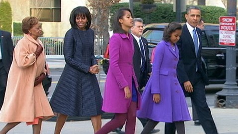
Mrs. Obama's inauguration coat!


Gray base with purple shift, artificial light


With flash in natural light, green shift!


Loving this color - beautiful formula, my first holo ever, and lovely color. A++!


Wednesday, August 7, 2013

Essie "Bachelorette Bash"

"vegas, anyone? girls' night out just got fashionably hotter with this wildly flirty, juicy fuchsia polish at your fingertips. vivacious creamy nail color is all the rage." -- Essie

Oh yum. This shade is a bright, shiny hot pink -- aptly named 'Bachelorette Bash,' it is the PERFECT polish. Super smooth application, so shiny it didn't even need a topcoat (which of course I used anyway -- four days before tip wear! That's pretty good for me!). Quick-drying, two thin coats and we were done!

I'm trying to show you my first attempt at polka dots here - I used a matter top coat on my ring finger, then using the head of a bobby pin, placed approximately eleven dots on my ring finger, creating super shiny dots! It was subtle, but I loved it. In the words of my SO, "Some girl out there somewhere would totally flip out over this, wouldn't they?" -- Yes, dear, they would. And by 'they' I mean 'me.' This turned out to be way easier than I thought, evening in applying dots with my non-dominant hand. I mean, just place a dab of polish on some tin foil, dip the head of a bobby pin in it, and dab it onto your nail. Not exactly rocket science (of which I am an expert, incidentally. ;) )

So can you see my dots in these photos? I googled 'polka dot manicures' and came up with literally GAZILLIONS of photos -- the nail blogging community is so flippin' creative, I can't stand it! Looking forward to showing you many dotted manicures in the future!


Sunday, August 4, 2013

Essie "Naughty Nautical"

With flash!
I am really beginning to have an obsession with mint/teal shades. Although I have only a small stash, the majority are greens and blues! :)
Naughty Nautical has been touted as the 'must have' shade from Essie's summer collection - and I can see why. A nice bold teal creme, could be a one-coater if you are more careful than I am. Added OPI "Tiara" to the tip of my ring finger (my first tiny foray into nail art!) - love the way it turned out. A nice bit of sparkle to break up the boldness of the color. Got many many compliments on this. A+. 


Without flash!

Thursday, August 1, 2013

OPI "Red Lights Ahead... Where?"

Oh man, I took like a hundred photos of this polish. It is NOT this orange in real life, but it definitely isn't a "Red," just a really smoking hot bright coral. The perfect summer shade. Had some issues with the pigmentation of the polish. It was a little uneven actually, had some dark patches. It was weird. That being said, it is still a great color. Applied nicely, I wore it for a week before taking these photos (hence the minor tip wear). Really in-your-face coral. I plan on wearing it when I am in Las Vegas in a few weeks. ;)

"Red Lights Ahead" - I believe this is an homage to Amsterdam's prostitution district. Odd choice for a nail polish. Especially since it implies the wearer is actually LOOKING for the red light district. Does anyone else find this odd??? 


Light from my window

Desperate to get the color accurate - ignore the  pasty hands! (Artificial lights)

Essie "Mint Candy Apple"

So I tried this shade, as it has been so popular- this minty/Tiffany blue shade is THE color of the year, I'm convinced. 
However, this particular polish? Fell a little short of expectations honestly. Sticky formula. It is a real creme polish, and I'm realizing I'm more partial to jellies. This is very pretty, more blue that Turks & Caicos. I'm planning to do a comparison swatch at some point. T&C is still my go-to for this particular shade.